


Designing icons for your brand may be an engaging and creative task for the whole team if you cooperate with highly professional designers. Brainstorming and choosing may be a fun process.
However, once you`ve finished all the preparation processes and have a ready icon set, what comes next? What would make them work best for your brand?
Icons are mini design elements that attract users and provide interactive cues. Thus, their potential should be used to the full. Starting with Facebook and Instagram icon links added to your emails via email signature software down to the most minor and insignificant icon buttons on your website, all of them should be perfect.
Read on to discover tips for using icons in your digital design to enhance your brand visibility and aesthetic value.
Icons and your website
When designing your brand website, you must have spent a lot of time considering the visual assets. Unfortunately, icons as small yet significant visual assets often get overlooked.
Indeed, icons are one of the minor graphic elements. However, they are the most widely used as well. Furthermore, icons stem from the remotest antiquity. Therefore, they hold deep meaning and perform a wide range of functions:
- Icons tell stories
- Icons describe functions
- Icons optimize navigation
- Icons reflect your branding and style.
Though they are small in size, icons have enormous potential. The key is choosing those fitting your goals best.
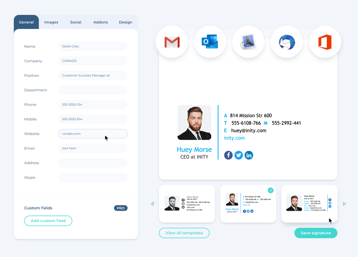
Clickable icons in an email signature
Being active on social media and sending out numerous business and promotional emails daily is a routine for your brand. Why not combine the efforts to boost your social media presence and conversion?
Clickable icons work well in this case. The appearance of social media icons in your email signature can bring you numerous followers and broaden your reach. Sounds too complicated?
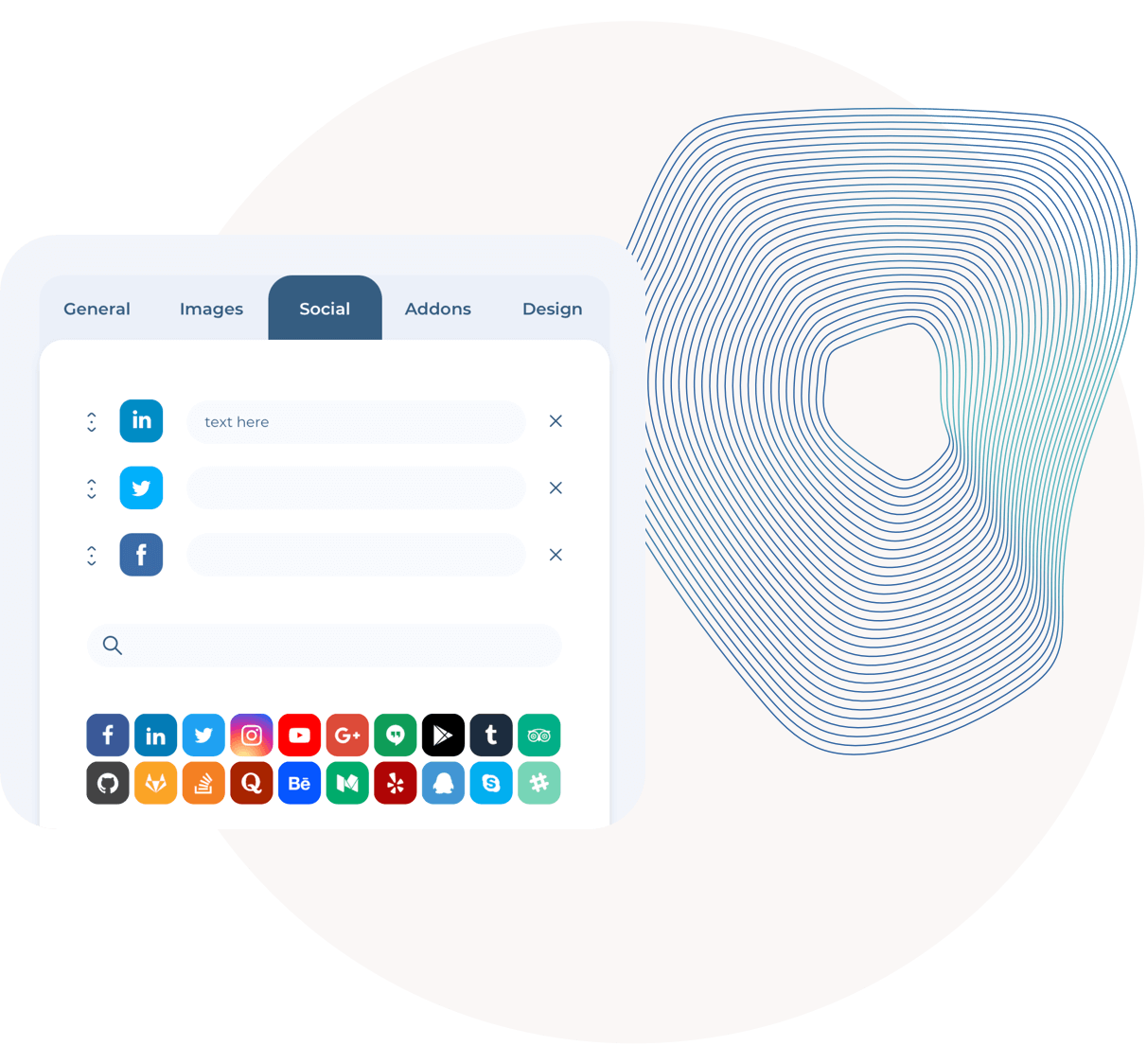
With the help of the email signature generator, you can easily add the icons, draw signature on your touchpad, include all the relevant information and other visual elements reflecting your brand style and voice within minutes.
Why waste time and opportunities?
Importance of infographics
In case you are still overlooking the power of infographics, you are making a huge mistake. Humans tend to process images 60,000 times faster than text. Therefore, infographics just can`t be ineffective.
An infographic uses a combination of visual elements and words to describe complex notions and processes. Thus the power of infographics multiplies the effort. Therefore infographic helps to:
- present the message effectively in a visually appealing manner;
- facilitate higher ranking in search engines
- make complex topics comprehensive and enjoyable
- track, monitor, and analyze the success.
Simplifying data into an appealing and digestible format with the help of visual elements is an effective way to reach people.
Less words in your promotional banners with icons
A persistent and consistent advertising campaign is what works well in any case. However, don`t forget about balance. Too much and too heavy ads may seem annoying, turning potential customers away from your business.
The banner ad makes you a name, drives traffic to your business website, and brings new customers to your front door. Yet, overloading your promotional banners and other materials with icons and extensive texts may be too much.
A well-known mantra ‘less is more’ definitely retes to text quantity in your promotional banners. In a world overloaded with banner ads, use large fonts and fewer words. Text often appears to be boring and misleading, while icons perform the same functions more effectively.
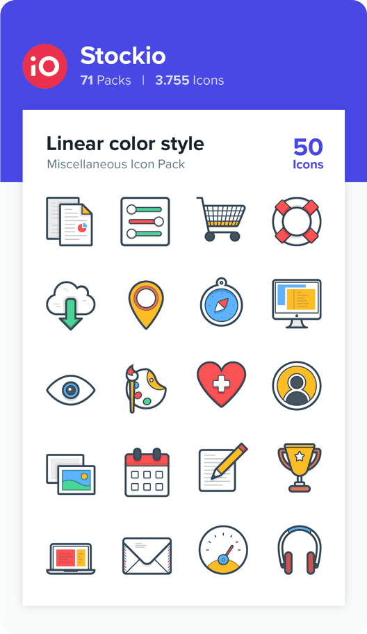
Most popular styles of icons
When you are well aware of the icon’s importance and essential functions they fulfill, it is high time to dwell on icons’ styles. While planning the icons that will expose the best of your brand and express brand voice, it is vital to simplify profound ideas to the point of the real-life object, which can be easily pictured.
In its turn, the icon style determines these specific objects will be depicted. With exceptions, all the icon styles in trend now are the variations of the 4 major types. Let`s get a closer look at each of these styles so that you could choose the most appealing to your brand. how
Outline icon style
Outlined or simply lined icons are clear, light graphic elements most commonly designed with thin monochromatic strokes. The outlined style icon trend never gets old. The key reason for such popularity is that this style works perfectly well everywhere with any background.
Furthermore, these icons are easy to see and understand as their elements are distictive. Therefore, many downloadable icon packs include versatile outlined icons, denoting standard elements.
Top tip: An excellent solution to make an ordinarily outlined icon a hit is to animate it.
Glyphicon style
Glyph icon style is a monochromatic style focusing on smooth curves and clear shapes separated by empty spaces. Borrowed from ancient Egyptians, this icon style has proved its efficiency through centuries.
Simply in its nature, this style works well, depicting elements in small sizes. A minimalistic and comprehensible glyph icon is easy to comprehend and associate with the category or action.
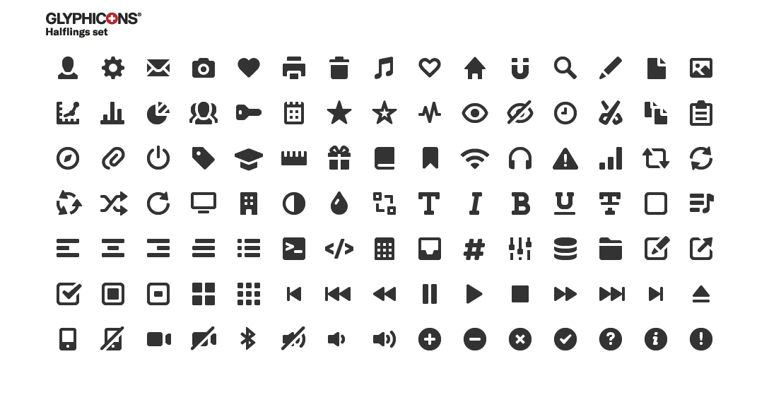
Top tip: try to rethink standard objects towards more minimalistic versions of them.
Hand-drawn icon style
The name of this style speaks for itself. The icons executed in this style vary widely from simple shapes and lines to full-color icons, having one feature in common – a natural appearance.
This iconic style is not that universal, yet the users very much appreciate it. Besides, a hand-written touch proves to create the feeling of intimacy and authenticity.
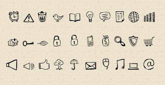
Top tip: consider curly or doodle substyles to create friendlier graphic elements.
Flat icon style
Flat icons depict simple real-life objects with subtle highlights and shadows yet executed in a clear and minimalistic manner. The lack of contrast is to be blamed for the name flat.
Colour, clean, and friendly flat icons can be very appealing with the right amount of details. The popularity of this style is predetermined by its simplicity and capability to integrate with many new techniques.
Top tip: partial animation of the flat icons can bring a fresh perspective on ordinary things.
Conclusion
Icons are part of the user experience. Used as clickable links to your social media accounts, website marks, or advertisement elements, icons provide valuable information about your brand at a glance.
Icons appear to be top visual communicators ensuring your audience’s engagement and reinforcing your brand awareness.


