Maps are an indispensable part of data visualization. Whether you’re mapping company locations or making a map to show how the stock market is doing, maps can be used in so many different ways. For example, if you want to know where your nearest stores or offices are located, then using a map is the best way!
There are several ways to use maps for data displays, and it all depends on what kind of information you want to show. Some people prefer using map creator software, while some rely on professionals to get their job done. In this article, we will look closely at how you can use maps to display your data and several other aspects related to data mapping.
What are maps, and how do they work?
Maps are a graphic representation of data that you can use in many different ways. They’re also called Geographical Information Systems (GIS), and they show how geographic features such as regions, countries, towns, or cities relate to each other on the earth’s surface–or another plane. Maps might look complicated at first glance, but there is actually nothing difficult about them!
Different map types:
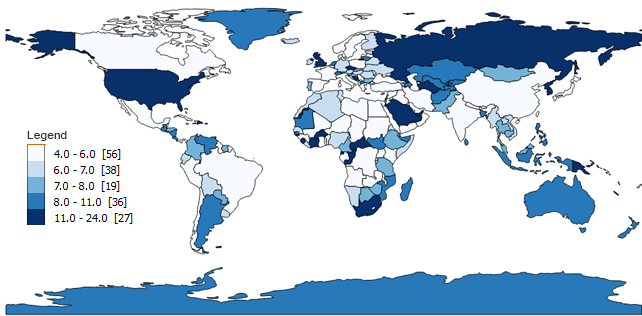
There are two main categories: topographic maps, which use shading and symbols to represent physical terrain; and thematic maps, which indicate phenomena related to human activity like population density or economic status with lines and colors.
There are even more detailed versions of these basic styles, including relief models for mountains, geologic cross-sections for mining concerns, shaded contour lines of elevation for topographic maps, and weather maps that show cloud cover.
- Topography: A map or drawing showing how the terrain (physical features) on the Earth’s surface looks like from above
- Thematic Maps: More concerned with phenomena related to human activities such as population density, economic status with lines and colors
- Relief Models: There are many different versions of these basic styles, including relief models for mountains; geologic cross sections for mining concerns; shaded contour lines of elevation for topographic maps
- Weather Maps: These types of maps display information about clouds in relation to other atmospheric conditions like temperature, pressure, humidity, etc.
The first step is deciding what type of map you want. For instance, if you want to show the number of accidents that have taken place, then a thematic map may be your best option. Likewise, you can consider your business needs and choose a map that best suits your requirements.
Benefits of using maps for data visualization:
- Maps are easy to read and can be tailored according to your needs
- They make it easier for readers to understand the data that is being shown. This makes maps a great option if you have more complicated information or user interface design elements like icons etc.,
- Maps give readers an overview of what kind of information will be included in the content they’re reading, so there’s no need for them to skim through long blocks of text before getting into the good stuff!
- Maps help your customers to understand your business in a way that other forms of data visualization might not.
- They also help customers to locate your business’s locations.
- Maps make it easy to show a change in trends over time.
- You can use maps for anything from mapping the most popular tourist destination spots, data on how your company is doing around the world, or even a customer service satisfaction survey!
Drawbacks to consider:
- Maps are complex and require more time, skill, and expertise than other visualizations.
- Maps need to be interactive, which means they can only show so much information at once before the reader will find it difficult to comprehend what is being shown on screen or paper (or whatever you’re using). This may mean that you’ll have to use several maps for one content piece, but this doesn’t make them any less useful!
How to use maps:
A map should be simple and clear enough that someone who has never seen one before can understand it at first glance.
Here are some tips to help you create great visualizations:
- Use as few colors as possible if you’re trying to convey different categories of information, so people don’t get confused about what they’re looking at.
- Make sure there’s an easily identifiable reference point, so readers know where they are and which way their mouse is pointing.
- Use clear symbols to distinguish different information so that readers don’t get lost in the map, or worse yet, misinterpret what you’re trying to say. For example, if you use a red circle for one piece of data and green triangles elsewhere on the map, then it will be difficult for your reader to tell which is which!
How not to use maps?
As with any other form of communication, there are certain things not do when using a visual such as maps – this includes but is not limited to:
- Failing to make them simple enough that anyone can understand without having seen anything like them before.
- Relying too heavily on colors.
- Adding unnecessary information (which may confuse people).
- Making sure all representations fall within the same category.
Conclusion:
With the map creation tools, creating maps has never been easier! There are many different tools that exist to help you use maps as data visualization, and there’s no excuse not to try it.


