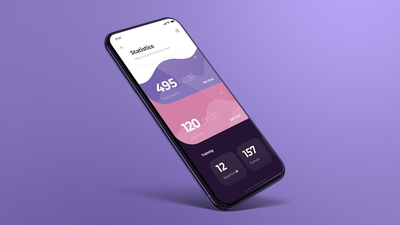
Both freelancers and the employees of professional UX/UI design agencies sometimes have to use animations in their design. This allows them to attract attention to important details and provide feedback to the user about their actions and the behavior of the program.
In today’s post, you will learn the basic parameters that are used to create animations and the principles that should be followed when creating animated content.
What is animation?
The animation is a picture with several frames that quickly replace each other. It creates an illusion of movement. It can be used for screen animation, buttons, menu elements, and more.
The speed of animations is measured in frames per second (FPS). The standard number acceptable to the human eye is 24 FPS. For games and web applications, it can be higher, about 60 FPS.
Key animation parameters
In UX/UI design, usually, nine main elements are distinguished: timing and pacing, transition, size, weight, gravity, resistance, action, and reaction. They were formulated in the Walt Disney company but are now applied by UX/UI experts like this agency. Let’s consider each of them in more detail. If you want to learn more, read “The Illusion of Life: Disney Animation”.
Timing
Timing refers to the number of frames needed to move an animation object from point A to point B. Timing is measured in FPS and calculated using a simple formula.
Calculation formula: real-time number * 24 frames per second.
Simply speaking, if a person in animation needs 10 seconds to cross the road, then under animation conditions, this time will be equal to 240 frames.
Timing is an important parameter for creating realistic animated content. Each object will need a certain amount of real seconds, which can be “converted” into the FPS parameter (frames per second). When creating simple animations, for example, a button in an application, timing is no longer the most important parameter.
Pacing
Pacing is the speed with which the object moves in the picture. When creating a pace, it’s important to find a compromise. If it is too slow, your user will fall asleep. If too fast, then the visitor will not have time to understand what happened.
Transition
This parameter is similar to pace, but it describes the transition time between screens. Try to make it seem natural so that the user has enough time to understand what is going on on the screen without waiting for too long. The perfect transition time can be found during testing.
Gravity
Gravity is the force that pulls objects to one another and to the ground. In animations, there are usually two gravity forces being used – the one that attracts the object to the bottom and the one that attracts it into the depths of the screen. In Google’s material design, they are called Y-axis and Z-axis. You can learn more about it here.
Size and Weight
On the web, objects have size and weight, just like in real life. It is especially true in the animations where you are trying to create a realistic world.
In order for your world to look natural, you need to organize objects in a hierarchy. The bigger objects need more space around them, and they appear more important. Smaller objects are secondary.
Use the center of each object as its gravity center. This way, your design will be more true-to-life. Don’t forget that when you resize your object or move it in space, its gravity center also shifts.
Resistance
Resistance is often used in animations when the user clicks on a button. Depending on the applied efforts, it may glow more or less.
Also, a similar system is used when the user wants to get fresh content, and they have to pull the interface in a certain direction. Having reached the end of the page, it will start the page reload mechanism.
Resistance is very important for good UX/UI design because it provides feedback to the user about the correctness of their actions.
Action and Counteraction
There is a reaction to each action, and this principle can also be used in UI/UX design. This is especially often used when choosing the size, color, background, fonts, and other elements.
When creating an animation, think about how the button will look before you click on it and after. This law can also be used to create various indicators of loading, successful data sending, failure, and other types of visual cues.
Conclusion
Each animation should be created for a specific purpose, for example, to notify the user, give him a hint, and show the main content of the company. The user’s movements should result in some clear, understandable actions.
When creating an animation, consider the basic parameters listed above. Decide for what purposes you need an animation, what it will serve, what benefit the user will get from it. Conduct tests to find out how the target audience perceives the animated content.
For example, if a user has to wait while clicking on a button, you can create a special animation that will precede the main content. When designing it, keep in mind the main goal of this type of animation (to attract the attention of the user), prepare them for future changes, and entertain them during the download.


