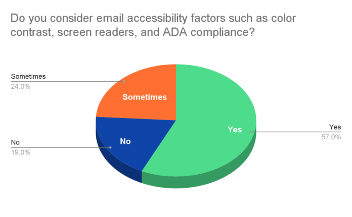
Accessibility has become an industry-wide best practice among email marketers over the past few years instead of being a mere discussion topic for blogs. This is well reflected in the fact that a whopping 57% of the email marketers take accessibility into consideration when working on their email effort. However, this leaves us with a considerable number of marketers that are yet to focus on consistently making their messages accessible to everybody.
In this article, I will focus on seven tips that will help you make your Mailchimp email templates instantly more accessible. Go through the below sections to see the email accessibility best practices that must become a standard part of your email development process. Let’s get started:
#1 Ensure That Your Subject Lines Don’t Lack On Relevance
When considering subject lines from the email accessibility point of view, you must understand that your efforts must be aligned with how screen readers work. This essentially translates to the fact that your subject lines must have a significant amount of relevance both contextual to the message and in terms of brand association. While you must not reveal too much about the email contents, it is necessary that you drop enough cues to establish your brand identity, the importance of the email, and why it should be opened. Remember, the average email user is bombarded by an unprecedented number of emails, and listening to all of them would be far more challenging than glancing at them.
#2 Use Preheader Text To Make Your Email’s Agenda Even More Clear
Preheader text is the gray text right beside your email subject line, which adds to the subject line yet reveals a rather more unique detail about the message. Here too, you need to provide more contextual information as opposed to stirring curiosity as the concerned individuals are likely to rely on screen readers. You must also ensure that the preheader text works as an aid to the listener by providing them with insights that a subject line may not be able to convey.
#3 Use Headers Consciously To Assist Screen Readers
One great way to increase your Mailchimp email templates’ accessibility is to use headers proactively across your design, as it helps segregate information. They not only help in establishing a visual hierarchy but also help build a convenient audio flow. For instance, if you discuss different aspects of your email under different headers, it will be easier for visually impaired readers to consume your message as they have a single frame of reference at any point in time.
#4 Use Lists And Simple Tables As A Part Of Your Formatting
Listicles and tables are two amazing accessibility enablers as they help you generate sorted datasets that can be consumed very easily. Lists help reduce the complexity and length of the sentences, allowing you to provide more extensive data without limiting your recipients’ ability to keep track of the topic. You can also use tables to serve this purpose but don’t complicate them, for it may produce the opposite of desired results. Also, don’t forget to mark up your table headers, as this makes it easier for screen readers to understand data.
#5 Add Alt Text For Every Rich Multimedia Element In Your Email
Adding alt text is basic to making your emails accessible, as images are unlikely to convey the desired message to people with disabilities. This also leads us to the fact that pictures must be used for representing simple ideas and things as opposed to featuring detailed information. The alt text must also be used when you are providing textual information within the email body using images, like in the case of infographics.
#6 Ensure That Your Fonts Follow Readability Best Practices
Fonts play a huge role in making your email more accessible as it is the primary medium of information exchange between the sender and recipient. Thus, you must ensure that the font color displays the right degree of contrast with its background, and you may also add a stroke to it if found necessary. Next, you must also indicate that your font color must not be used for symbolic applications, such as using green color for a positive idea and the color red for something unwanted. Also, your choice of fonts must be simple and easy to read, while the font size must also vary to ensure that message aids in the consumption.
#7 Try Including A Plain-Text Version Of Your Email
Lastly, it is highly recommendable to include a plain-text version of your email as it helps cut down all possible complexities. The plain-text version will help you condense the email contents and come up with a clear-crisp version of the message, which also becomes lucid in terms of expressing the email contents through aids like screen readers.
Wrap Up
No doubt, accessibility in emails is becoming mainstream and even a part of the email design best practices, but marketers need to include it as a part of the strategic considerations too. For instance, the complexity of the message should be well thought out in terms of consuming emails from a voice-only perspective which would require using modular templates only. With these tips, you will be able to improve your message’s accessibility to a large extent, but you must also put work into the overall approach to email marketing.
Author: Kevin George is the head of marketing at Email Uplers, that specializes in crafting Professional Email Templates, PSD to Email conversion, and Mailchimp Templates. Kevin loves gadgets, bikes & jazz, and he breathes email marketing. He enjoys sharing his insights and thoughts on email marketing best practices on email marketing blog.


