Shopify has emerged as one of the most popular ecommerce platforms. In May 2021, the company had 170,000,000 clients in 175 countries, making it a truly global brand.
The reputation stems from the ease of use and attractive design of Shopify ecommerce websites.
Anyone can hire a Shopify developer to launch a store and take part in the $4.8 trillion global ecommerce marketplace.
What are the latest trends in Shopify website design? We take a look.
8 Exciting Shopify Storefront Trends in 2021
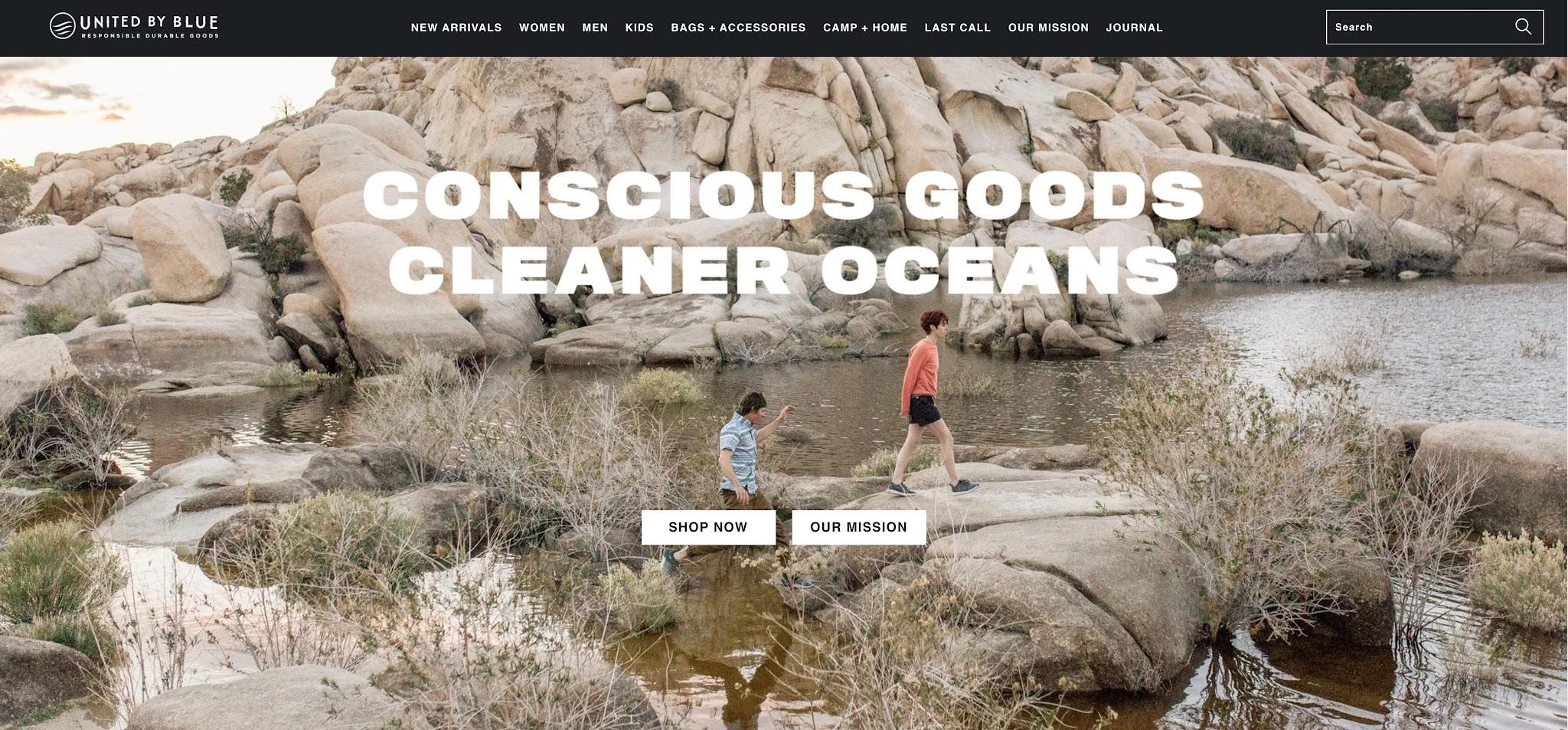
1. Centered Navigation
For years Shopify developers have tucked away the menu to the side and made it unobtrusive.
Even the best Shopify themes had no scope to change this layout. Times have changed and customers do not have the time to hunt for icons on the top or sidebar.
Placing the menu front and center provides several advantages.
Quick navigation encourages visitors to delve deeper and not bounce away from the home page. Above all, you want the customer to stay on the site and not veer away.
Placing the menu upfront makes smartphone browsing easy. Till now, most layouts had the menu hidden in a sandwich icon at the top. Too much work to unhide it and click the sidebar that appears.
Mobile accounts for 65% of all ecommerce traffic. Making things easier for the bulk of customers is of prime importance.
Use a Shopify theme that allows you to place the navigation in the center of the home page.
2. Visual Immersion
What is the biggest drawback of online shopping?
There is no visual feedback. That is a huge disadvantage since our visual cortex is massive and we make sense of the world around us primarily through sight.
Sure, to a large extent, high-resolution images help, but in a very limited manner. An online store has no way to let the customer inspect the goods and feel their texture through vision and touch.
Now is the time to take advantage of next-generation web technology. Extensive use of VR and AR can make up for the deficit.

Animations have been used to pretty up a website in the past. But AR goes far past that and is more customer-centric. Product zoom-ins and tilt provide a more interactive experience.
You could also display cutouts and show the product from several angles.
It’s all about getting the customer to have more confidence while buying and the more immersive the experience, the better.
3. Asymmetric Design
For the past 20 years, website design has held on to a maxim.
The entire page has to be divided into neat sections and all the content and typography have to be symmetrical. It’s as if websites are designed to look like a brick.
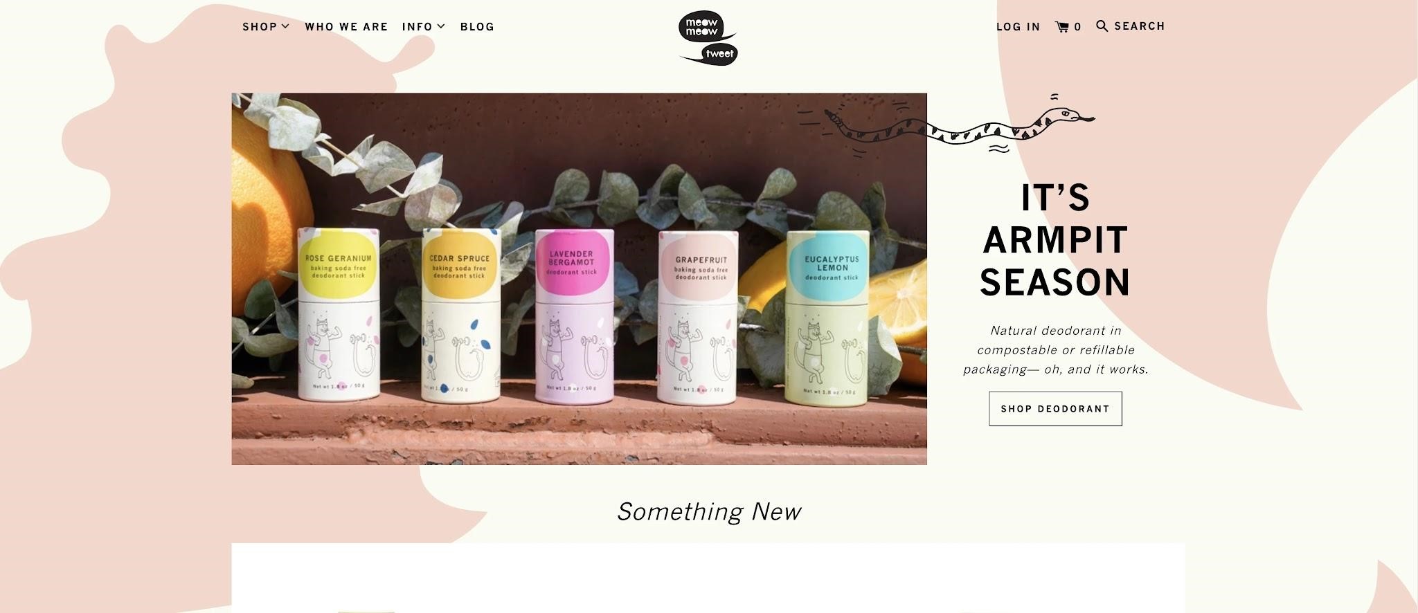
Thankfully, the old rules are on their way out. Using an asymmetrical layout and mixing up fonts can add a touch of mystique to your site.
Of course, use an abundance of caution. A hint of too much and it can all look really messy indeed.
Novel arrangements such as horizontal scroll can make an enormous difference since it makes your site stand out from the rest.

There has also been a remarkable shift in font choices. Retro serifs such as Wicked Hearts are back with a vengeance. So are animated transitions between pages.
Do all you can to catch the visitor’s attention. Being unconventional can be enough to make your site successful.
4. Pastel Shades
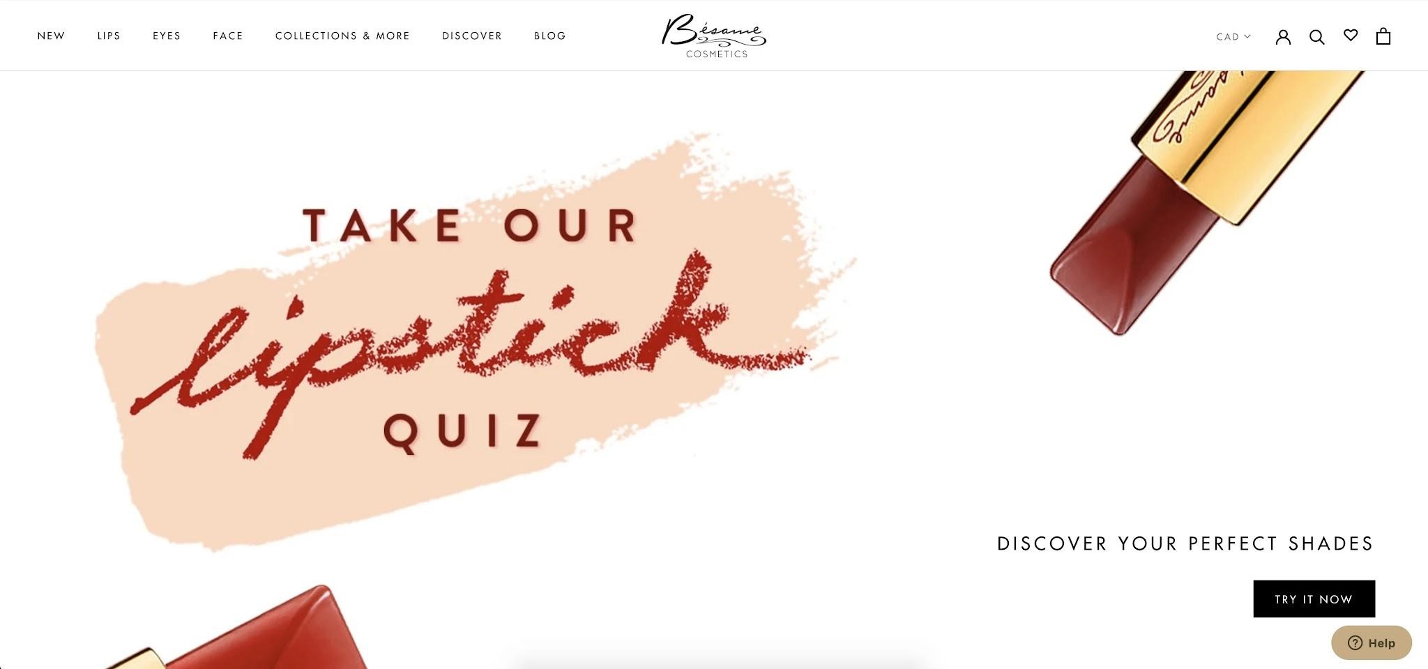
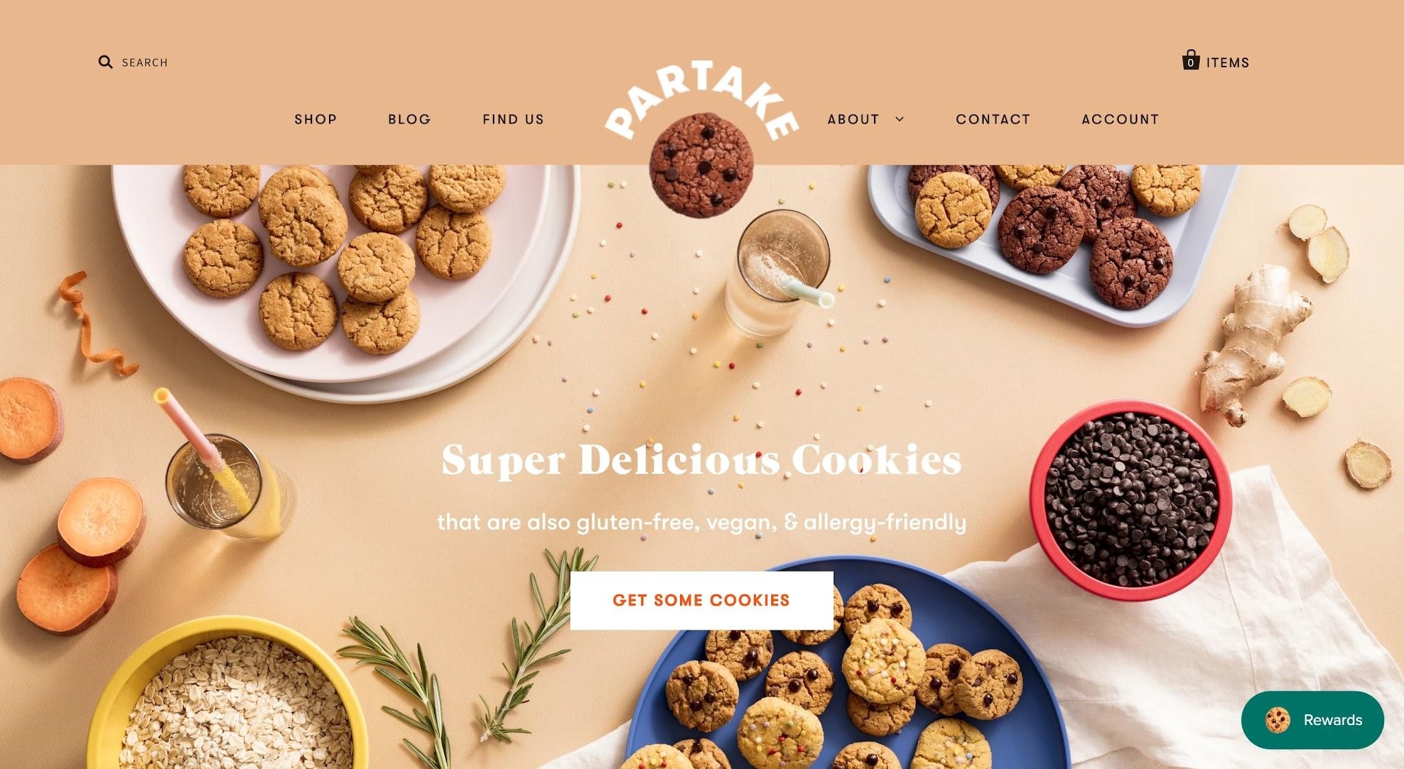
Muted pastel hues are trending. The attention has moved away from a vibrant look, symbolic of the brand’s virility to more subdued and earthy tones. Energizing shades have been replaced by a more grounded and passive tonality.
Soft shades with low saturation do not strain the eye. A visitor can at ease scroll through a dozen web pages on your Shopify site without needing aspirin to get rid of their headache.
Combined with minimalism, the less is more approach has taken hold in Shopify store design.
More than that, lightly built themes allow the site to load swiftly. That perfectly ties in with your SEO efforts, since page loading time is a significant factor for ranking high in the Google algorithm.

5. Graphics and Photo Together
Running an ecommerce business is tough. You want any advantage that helps you stand out. Online stores have traditionally displayed images. Now the designs have gone a step further with a mix of graphics and images overlay.
The latest Shopify themes have begun to reflect this trend. To make a page stand out, it is best to overlap graphics and images and emphasize the creative aspect of your brand.
Will it become a prevalent feature? Only time will tell. But for now, it is a fantastic idea to help you stand out from your competitors.

6. Dark Mode
Otherwise known as night mode, the feature debuted on social media apps and Google. Now the same is available for Shopify sites too, thanks to advances in design.
Usually, the dark mode turns on automatically at night, but users could choose to have them active at any time. Modern OLED screens are particularly suitable for dark mode viewing.
It is critical that the website design is equally legible in both light and dark modes. Do extensive A/B testing before releasing the feature.
7. Better Chatbots
By this time, everyone has interacted with chatbots. What used to be a novelty a few years back is available as a plugin now.
What matters now is that chatbots have become capable of so much more. Through a more sophisticated use of AI, they can guide the customer through the buying process, offer suggestions, and provide rapid response. The overall experience is more wholesome for the buyer since bots act as personal shopping assistants.
While basic chatbots are good for customer support, more advanced versions have a more inclusive approach. Of course, the initial investment is a little pricey but over time pays off through more sales.
8. Micro Animations
Why not use GIFs to spice things up a bit. After all, it doesn’t hurt if the customer is entertained while they shop.
Micro animations can help a lot in this regard. Instead of a static button that says “add to cart” why not a cute little animation of a cartwheeling away when the button is clicked.
The principal focus is to enrich the customers’ experience through an engaging interface and animations are a perfect solution.
Wrapping Up
We have provided an overview of the 2021 Shopify design suggestions that would give your store a peppy and contemporary look.
When combined with a great product lineup and the unbeatable price, your store would become a blockbuster overnight.
But it is not so easy to implement these changes. Would you have someone with doubtful experience fiddle with your Shopify store? They could end up doing more harm than good.
For this reason, employ an experienced agency such as Uplers. They have been working on Shopify sites for over a decade and have seen the transformation up close.
Moreover, they are highly affordable and guarantee you complete satisfaction.
Your store needs a makeover. Call them now.


