


Nowadays, dashboards are undoubtedly an indistinguishable part of the business process and one of the most valuable business resources. Visualizing data and acting on the provided analytics is no longer a luxury but a business necessity.
As per Stephen Few, “A dashboard is a visual display of the most important information needed to achieve one or more objectives, consolidated and arranged on a single screen so the information can be monitored at a glance.”
The dashboard plays a pivotal role as a business intelligence system. creating links between the company and its objective by enabling departments to collaborate more effectively while helping employees to reach maximum productivity. With the help of an efficient dashboard, you can simplify the working environment and easily analyze massive volumes of data to bring the right answer at the right time.
Since dashboards are inevitable, how would you ensure you have the best one?
To answer this question, we will delve deep into the basics of dashboard design to help you find the best possible way to create an interactive and beautiful dashboard for your application.
Let’s get started.
5 Steps to a Beautiful and Interactive Dashboard for Your Application
Define people and their purpose
Dashboards are built to fulfill the requirements of your users. To create a beautiful dashboard, you need to identify the audience and the dashboard’s purpose because, no matter how attractive it is, it is of no use if it doesn’t serve the purpose.
“It’s all about what information is crucial for your business.”
For example, a car’s dashboard is built with an objective to meet the needs of a driver so that he or she can be informed about speed, fuel, and other driving-related economics. If it had been designed for passengers instead of drivers, factors like engine RPM would matter less, and the passenger-related aspects like choosing a song on the radio would become essential.
Once you have identified the audience, you need to investigate the user’s purpose. Like in the example above, you need to know whether the driver is trying to get from one point to another or the passengers are trying to find the right travel song. Every dashboard design decision is a choice, so understanding primary user goals will help you make the right ones.
Choose the right type of dashboard
Yes, you read it right. Dashboards come in many shapes and sizes and can be classified into three main types:
- Monitoring dashboards
- Interactive analytic dashboards
- Navigational dashboards
Monitoring dashboards
It is the most traditional form of dashboard and provides information that should be constantly visible to the user and available at a glance. In this type of dashboard, there is a one-way interaction. Though this dashboard might provide a plethora of information through data analytics, most of the audience are expected only to understand the information, while any decisions based upon the provided analytics may be made by others.
Businesses might use the monitoring dashboard in the following ways:
- To get an overview of the business process
- To check the health status of various business components
- To provide a beginning point for daily management operations
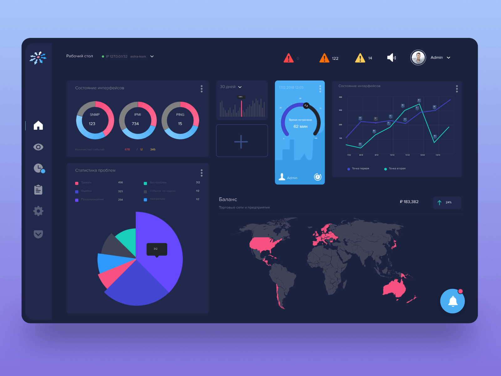
Interactive analytic dashboards
This type of dashboard is becoming a common choice nowadays.
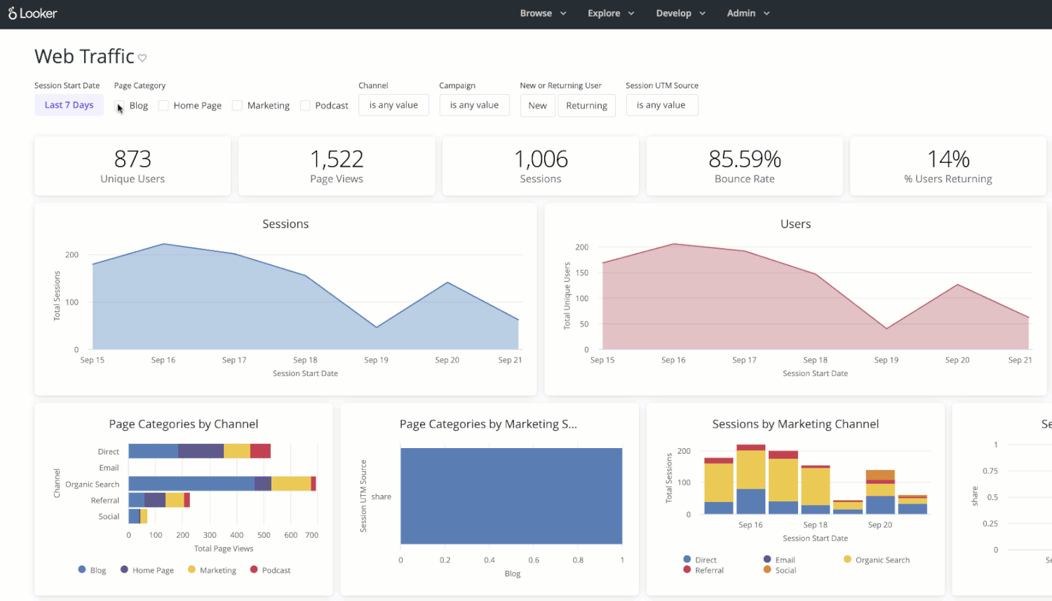
Interactive analytic dashboards don’t provide large amounts of information quickly, as in the case of monitoring dashboards. With this type of dashboard, users can take action or scroll deeper to gain more insights about any KPI. This efficient data visualization is attained by connecting multiple charts through common filters and selection, where each chart encompasses vital details and insights on a particular metric or KPI.
Navigational dashboards
Navigational dashboards can be termed as the table of contents, in which a central page leads to detailed pages. It is different from others as each statistic in this type of dashboard represents broader elements. Since the value differentiates the items, it clarifies to the user which element to interact with to get more information on specific metrics.
Display the right data in the right way
Data granularity
Once you have identified the users, their purpose, and the right dashboard type for your business, you can segregate the information into more simple questions. All of this will help you create and represent the true value for your dashboard.
If the question is broad, you may not be able to get the right analytics or may require a lot of information to get an answer with some accuracy. On the other hand, if the question is narrow, it’s unlikely to be able to address and solve the user’s bigger purpose.
An imperative element of beautiful and interactive dashboard design is the ability to find the right question you want your dashboard to answer. Like in any other design, it starts with research. You need to make sure your data does not dictate the content flow of your dashboard.
Organize logically and progressively
When displaying metrics using multiple displays, you should ensure proper alignment to these metrics in the dashboard. When you are arranging charts in your dashboard, you must consider:
- The natural reading direction of target users
- Display size (4k monitor or tiny mobile phone—if it’s for both, check for responsiveness on both platforms.)
- Time alignment (multiple charts with the same time range are easy to correlate)
When you have a dashboard with logically ordered charts and widgets, you create a user interface for your dashboard that provides answers to all your key business metrics. Fitting all that on a single screen is tough, and scrolling down defeats the purpose of the dashboard. This is where structuring plays a prominent role in strengthening the appeal of your dashboard.
Keep your primary metrics or key performance indicators in the default dashboard display. You can choose to disclose them progressively by either using the collapsing feature or moving them out to their separate navigable dashboards for secondary and tertiary business parameters. In case you choose to go with a navigable method, you need to ensure the navigation to each chart is clear and accessible.
Enhance with styling
Now you have one or more dashboards filled with chart displays providing insights into the key metrics, so it’s time for the most important part—styling. The use of the right colors and fonts extends the dashboard from simply functional to exceptional with a beautiful interface.
Colors
One of the critical things to compare across different charts in your dashboard is the data source. It is crucial that data on multiple charts (even different chart types) represent the same data sources in the same way, especially regarding colors.
You should also consider color combinations as different colors are interpreted differently. People have preconceived notions about some colors, and overusing them might confuse dashboard users. For example, many people link the color red with errors and the color green with normal and healthy. Another consideration is that red-green color blindness (deuteranopia and deuteranomaly) affects almost 7% of the world’s male population.
So you should try to avoid these two color combinations and choose to go with more dynamic and contrasting color combinations like yellow and blue or black and orange.
Fonts
Choosing the right font for your dashboard interface is not an easy task. Charts display text in a comparatively smaller size than the body text, and as a result, you need to use a readable font at small sizes. Also, in charts, fonts are largely used for numeric values compared to other parts of the interface, so you need to consider how numbers will be rendered during data visualization through the dashboard.
Drill-downs
If you are trying to create a beautiful and interactive dashboard, you should consider drill-downs. This feature enables the addition of more levels to the chart—users can simply click on the visualization to drill into the lower level of the X-axis. Also, this feature provides the capability to nest additional variables into the chart with a simple click and change the chart according to your parameters.
Animation
The animation option in any dashboard can turn an ordinary data visualization practice into an extraordinary one as it makes an additional visual impression. Animation provides an effective automated moment based on desired speed (fast, slow) and types (linear, swing, etc.).
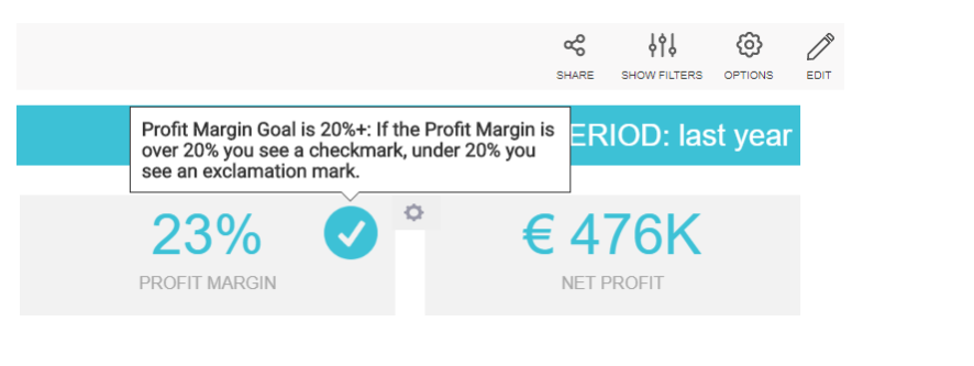
Information tooltips
Often, you need to present and explain much information to your audience. The information tooltips feature lets you add specific information to text boxes and images that triggers upon hovering with a mouse at a particular location. This feature helps dashboard users by:
- Providing contextual help
- Defining complex dashboard features
- Assisting in form fields
Time interval widget
Another interactive dashboard feature that adds beauty to your dashboard is the time interval widget. It allows you to enhance individual time scales on multiple charts of your dashboard with an interactive drill-down functionality. This feature is helpful especially when you want to change time intervals quickly without affecting the data visualization of the dashboard.
Dashboard widget linking
This feature helps to unify dashboards. With the dashboard widget, you can add any link to any widget, whether it’s a text box, image, or chart to redirect viewers to other related content. Moreover, you can link another dashboard tab or even an external website as well.
Wrap Up
In the age when data is the new gold, shooting randomly in the dark isn’t enough. To win in the future business world, you must be able to extract the maximum amount of the most relevant information from the huge data sets belonging to your business.
Data visualization in its most appealing and eye-catching form is a challenge for businesses, but once accomplished, it unlocks a whole array of benefits, eventually leading to business growth. When you embrace the above-discussed strategies, FusionCharts can ensure the most effective and beautiful dashboard for your application that provides valuable digital insights into the key metrics to identify and implement positive strategic actions.

 – Create Stunning Videos with AI")
